Knowing how to properly layout elements is very essential when it comes to designing a webpage layout. There are different methods to aligning elements on a webpage with CSS and they are; display, float and the position property.
In this article, we'll learn what the CSS position property is, it's five different values and how to use offset properties to set the final position of elements.
The CSS position property simply defines where an element is placed on a webpage.
There are five main values of the position property:
- Static
- Fixed
- Relative
- Absolute
- Sticky
Right after setting the position property of an element with it's value, the top, right, left, bottom and z-index often called the offset properties are used to manipulate the location of elements and place them exactly where you want. In a much clearer term, the prerequisite to using any of the offset properties is to first set the value of the position property.
Let's dive into understanding how these values works.
Static
When it comes to this value, there is absolutely no need to set elements to position: static for it is the default position of every HTML element in a webpage. Here elements are displayed based on the document flow (i.e how your html is structured) and neither does the offset properties have any effect on this value.
The code snippet below shows a static positioned element by default.
HTML

CSS
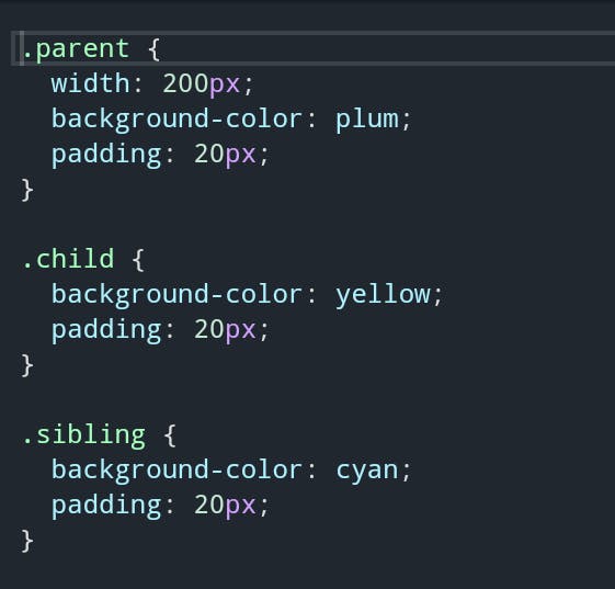
Results
Fixed
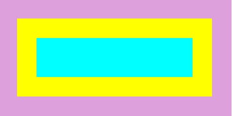
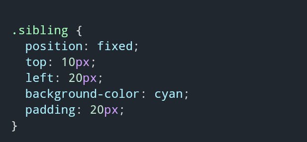
An element assigned with the position: fixed is positioned relative to the viewport i.e elements do not move when scrolled up or down. You can, however, use the offset properties to set its final position.

Relative
With position: relative, elements can move from it's normal position based on any offset properties set to it.
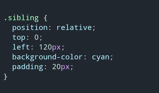
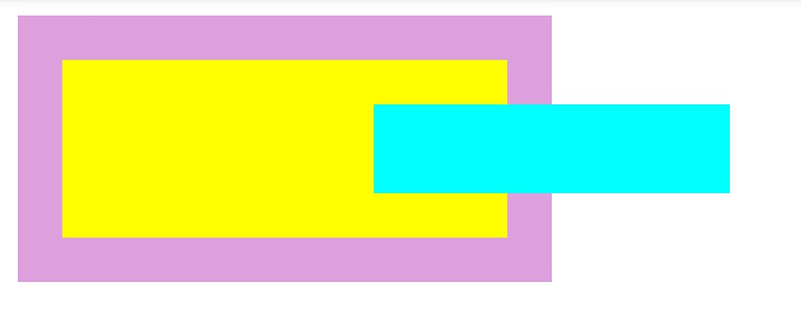
Note: The space where the relatively positioned element occupied prior to setting the offset properties stays intact and the contents surrounding it are not affected either.
Absolute
When set toposition: absolute, the offset properties positions elements based on the nearest parent container. If there is none, it assumes the body of the page as its parent container.
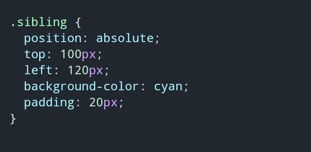

The above results shows that the
.siblingelement uses the offset properties; top and left to position itself by assuming the body as the parent.
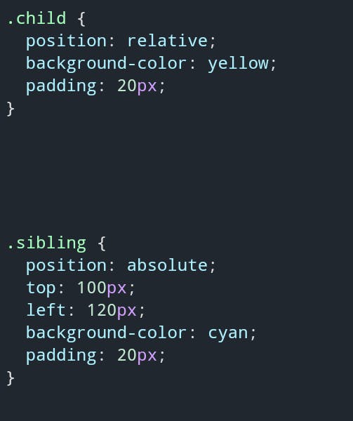
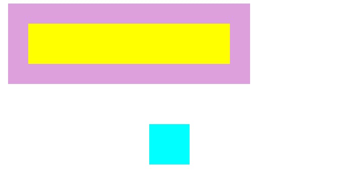
The results displayed above shows that the
.siblingelement is positioned 100px from the top and 120px from the left relative to the.childelement.
Note that if an element is positioned absolute, the normal position collapses and the element is removed from the document flow in contrast to relative positioning. The other elements surrounding it ignores the space completely.
Sticky
Elements positioned using position: sticky, behaves as relative and fixed values. When a user scrolls on a page, elements tends to be relatively positioned and when scrolled to a particular threshold of the offset properties set, elements get fixed at a spot. This value is not commonly used for it is not supported by some browsers.
Note: Offset properties can take in negative values as well and can be measured in percentage.
z-index is applied when you want to stack elements over one another. This property takes either positive or negative interger without any form of measurement e.g z-index: 1;.
Finally, like any other aspect of writing codes, practice goes a long way in knowing the concepts. To fully understand CSS position property techniques you need to lay your hands on practice projects.
I hope you find this article helpful. Kindly leave a comment below and don't forget to like and share.
Thanks for reading!.
